Minimalist coffee table styling looks simple on the surface, but it’s often where people get stuck. You want that clean, calm aesthetic—but once you remove too much, the table can start to feel unfinished instead of intentional.
The difference between “minimal” and “empty” comes down to balance. A well-styled coffee table doesn’t rely on quantity. It relies on proportion, texture, and a sense of visual structure.
Here’s how to get that effortless minimalist look without crossing into bare or lifeless.
Start With One Strong Anchor
Every good coffee table arrangement needs a starting point. Think of it as the visual foundation that everything else supports.
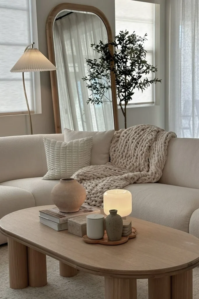
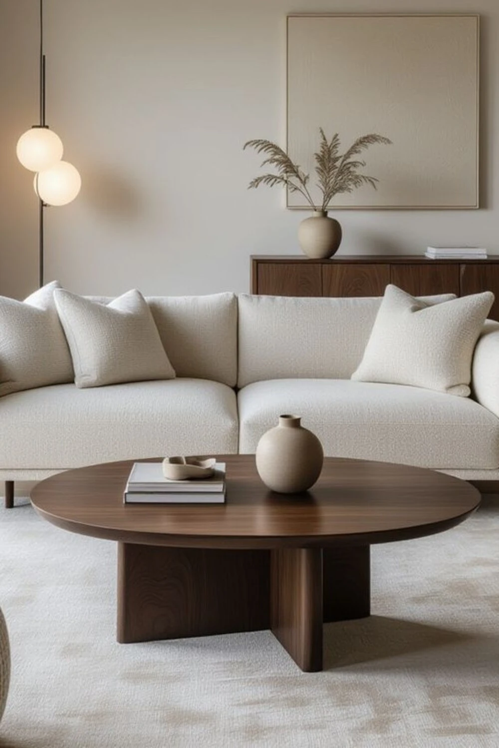
Instead of scattering small items across the surface, choose one piece that naturally draws attention. This could be a sculptural vase, a stack of large books, or a decorative bowl with presence.
What matters most is scale. A common mistake in minimalist styling is choosing decor that’s too small for the table, which makes the entire space feel under-styled. One well-chosen anchor instantly fixes that issue by giving the eye a place to land.
Once that piece is in place, the rest of the styling becomes about supporting it rather than competing with it.
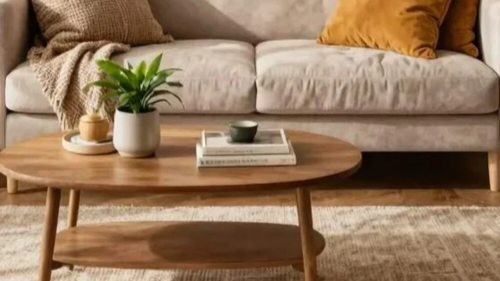
Build Small Groupings Instead of Single Items
A single object on a large coffee table often reads as “unfinished.” Instead, grouping items creates a sense of intention without cluttering the surface.
A simple way to think about this is in threes. Not because it’s a rule, but because odd groupings tend to feel more natural and less staged.
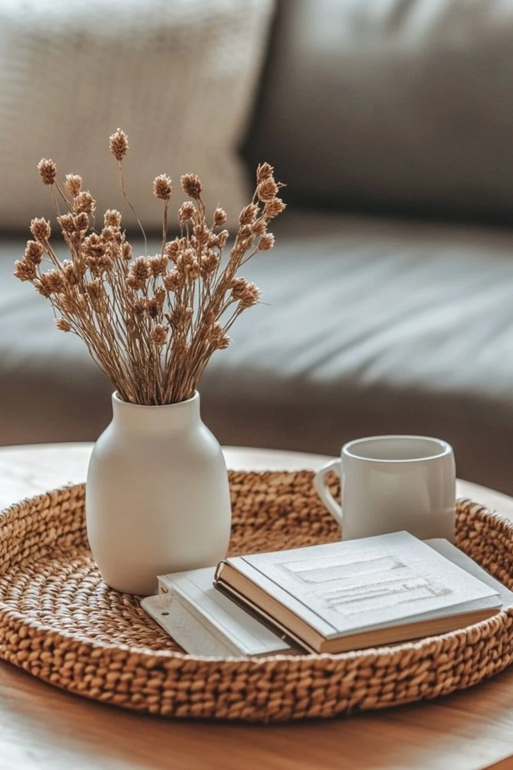
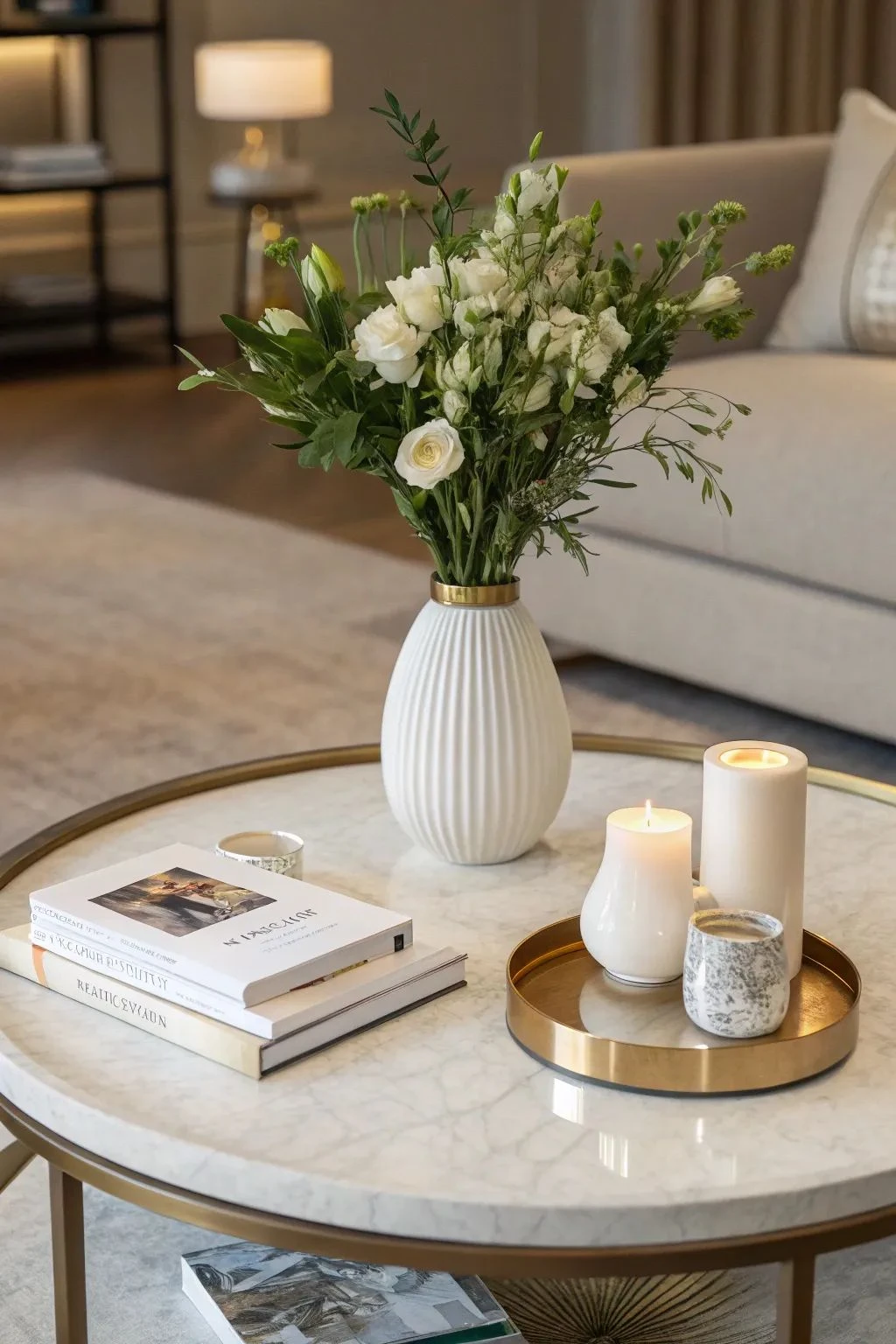
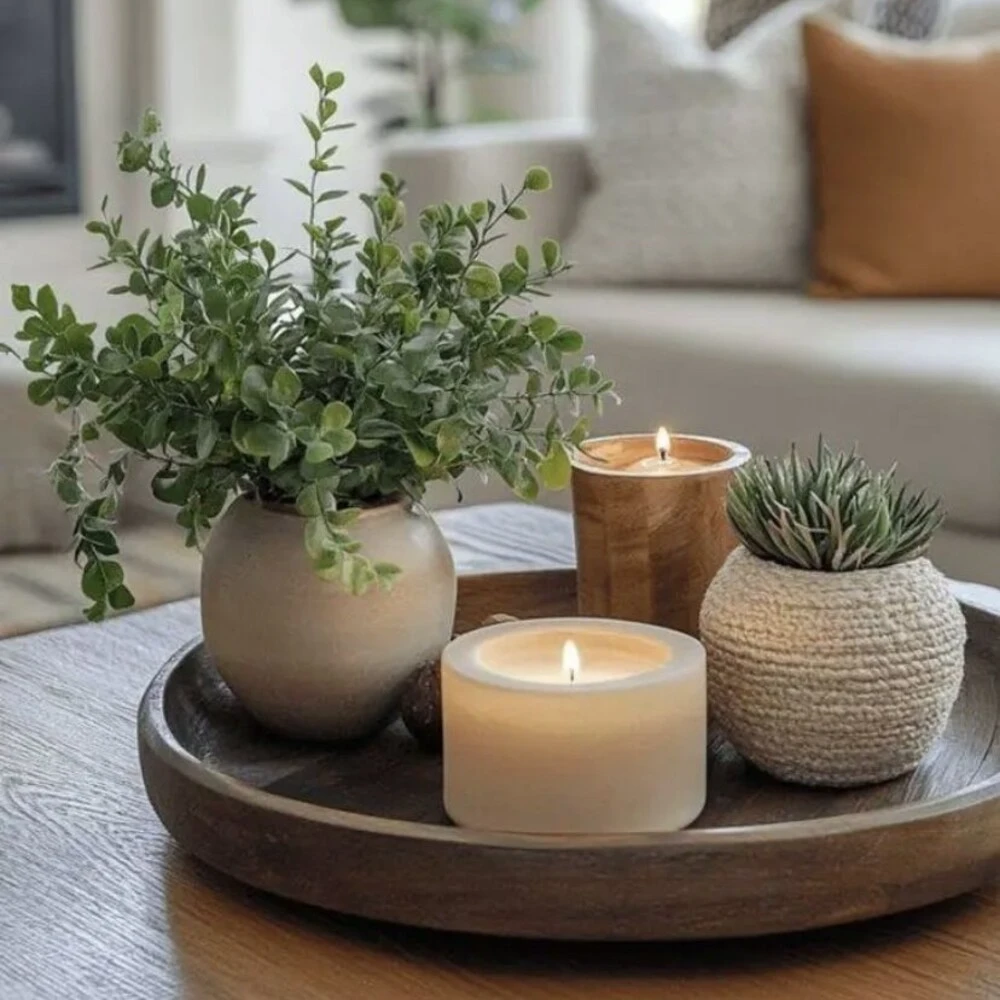
For example, you might combine a couple of stacked books with a small decorative object and a subtle accent like a candle or diffuser. Another approach could be a tray holding a vase and one smaller object to balance it.
The key is not the number itself, but how the items relate to each other visually. They should feel like a small moment, not random placement.
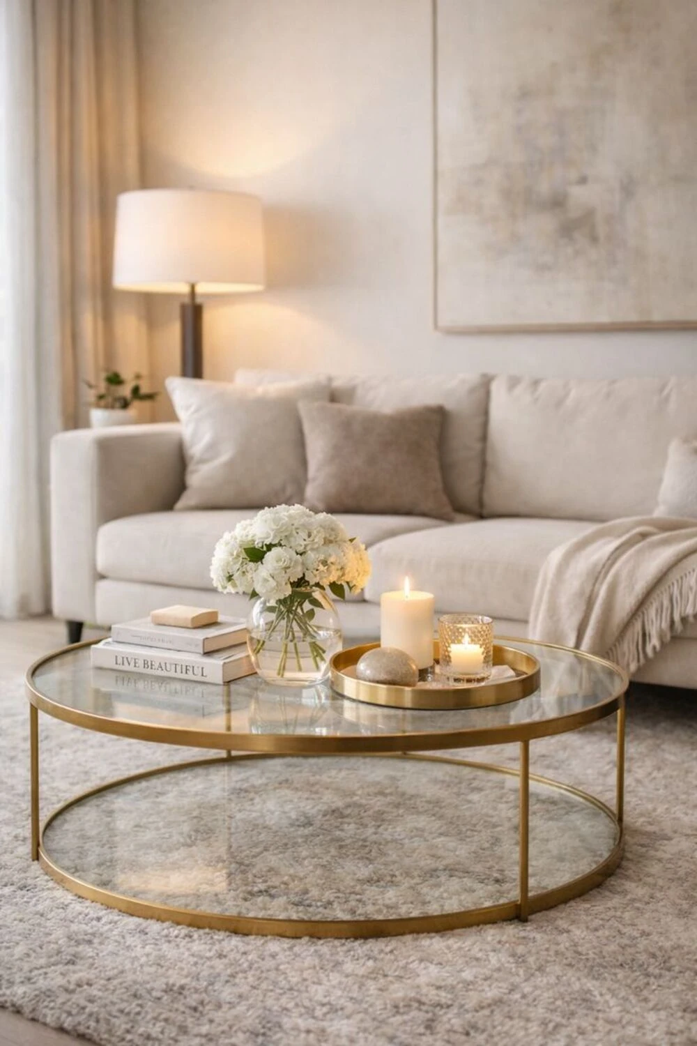
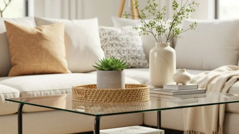
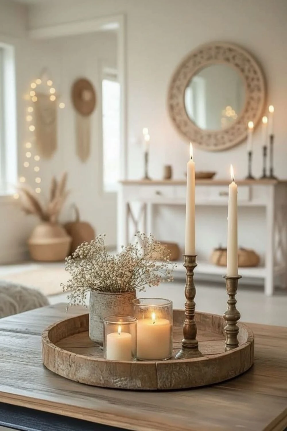
Use a Tray to Ground Everything
If there’s one styling trick that instantly makes minimalist decor feel intentional, it’s using a tray.
A tray creates a boundary. Without it, objects can look like they were just placed wherever there was space. With it, even simple items feel curated.
The material of the tray also plays a big role. Wood adds warmth, marble feels more elevated, metal leans modern, and woven textures bring in softness. You don’t need anything elaborate—just something that visually contains the arrangement.
Even a very simple setup becomes more complete when it’s visually grouped.
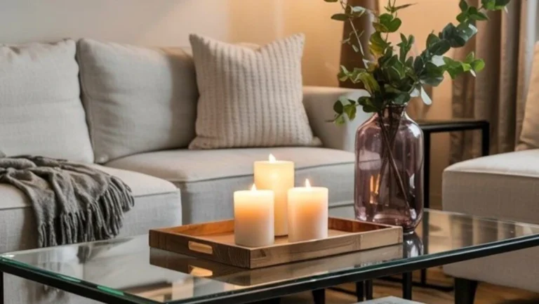
Create Subtle Height Variation
Flat styling is one of the biggest reasons minimalist coffee tables feel empty. When everything sits at the same level, the eye has nothing to move through.
Instead, think in layers. A taller element, a medium-height object, and something lower create a natural rhythm. It doesn’t need to be dramatic—just enough variation to give depth.
For example, a tall vase next to a medium candle and a low stack of books already creates a balanced visual flow. The goal isn’t complexity, but softness in the transitions between heights.
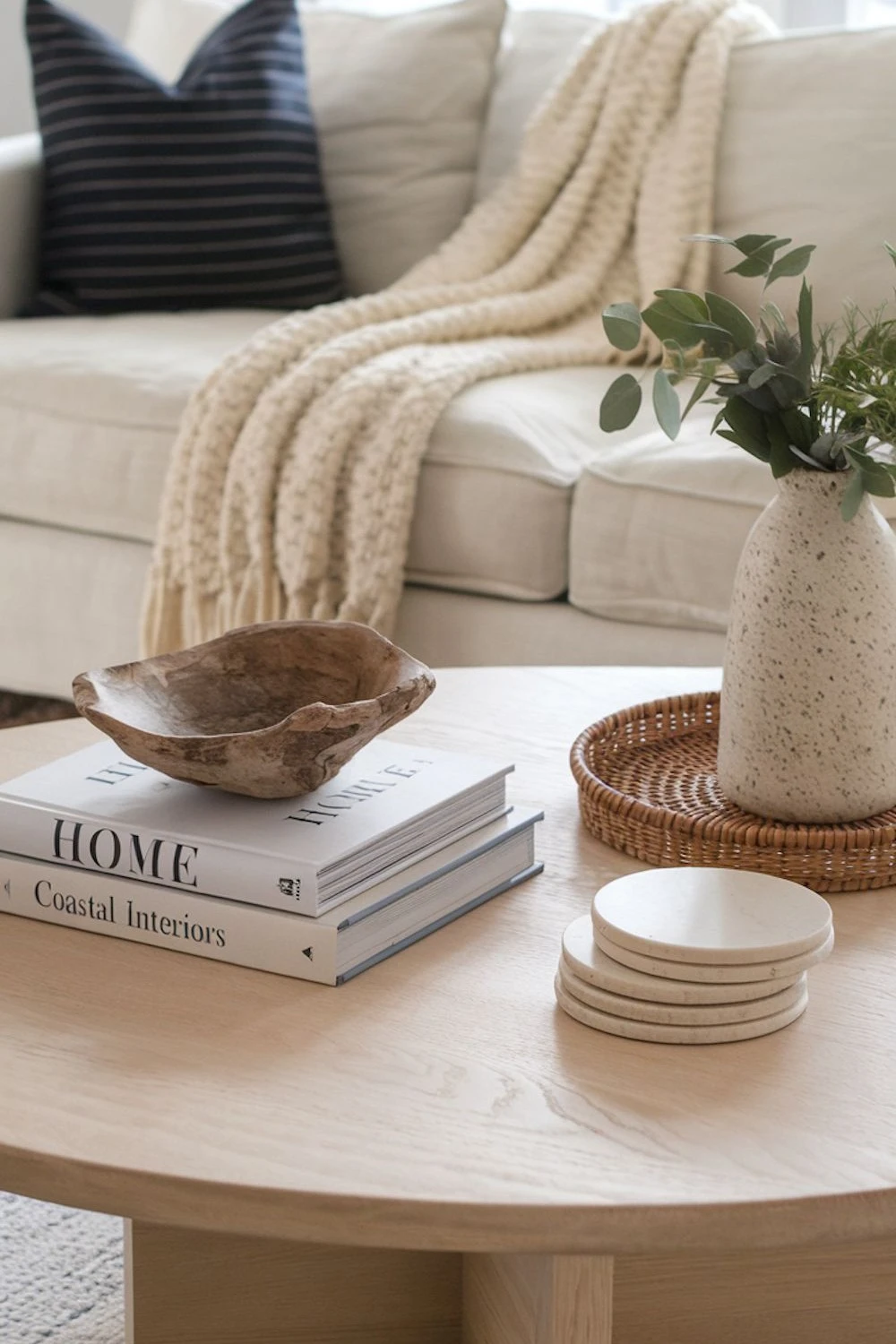
Let Texture Do the Work
When you’re working with fewer objects, texture becomes more important than quantity.
A minimalist coffee table should never feel visually flat, even if it’s physically uncluttered. That’s where material contrast matters. A smooth ceramic piece next to a rough wood surface, or a matte object beside something slightly reflective, adds quiet richness.
This layering of textures is what keeps minimal design from feeling sterile. You don’t need more decor—you need more variation in how the surfaces feel visually.
Add Something Organic for Softness
Minimalist spaces often risk feeling too structured. One of the easiest ways to soften that is by adding something organic.
A small branch in a vase, a bit of greenery, or even dried stems can change the entire mood of the table. These natural elements introduce irregular shapes, which contrast beautifully with the clean lines of furniture and decor.
You don’t need much. In fact, one simple natural element often feels more modern than a full floral arrangement.
Leave Space on Purpose
Empty space isn’t something to fix in minimalist design—it’s part of the design itself.
The mistake many people make is trying to fill every corner of the coffee table. But a well-styled surface always has breathing room. That negative space is what allows the chosen objects to stand out.
At the same time, the table should still feel usable. You should be able to set something down without disrupting the entire arrangement. The balance sits somewhere between styled and functional, not fully filled or completely bare.
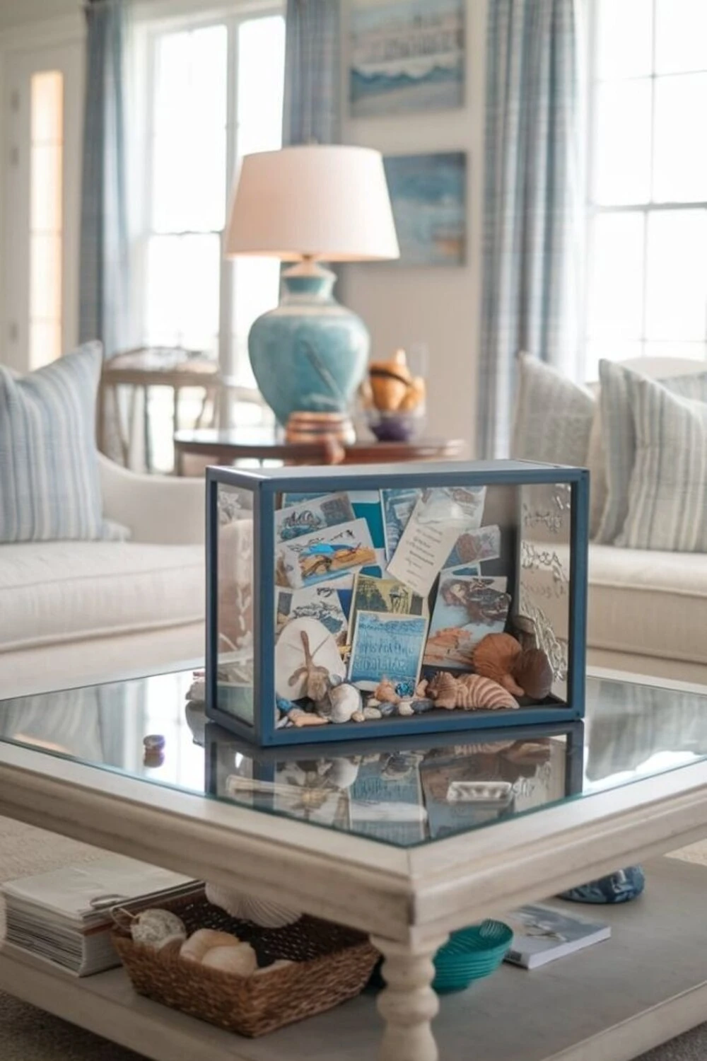
Include One Personal Detail
Minimalism can sometimes lean too generic if everything feels like it came from the same showroom. Adding one personal object solves that instantly.
This might be a favorite book, a small travel object, or a handmade piece with meaning. It doesn’t need to stand out loudly—it just needs to feel like it belongs to you.
That single personal touch is often what makes a minimalist space feel finished rather than staged.
Simple Styling Approaches You Can Repeat
Instead of overthinking every arrangement, it helps to have a few reliable combinations in mind.
A calm, modern setup often starts with books, a sculptural object, and a candle. A warmer version might use a tray, a small plant, and a diffuser. If you prefer something slightly more elevated, pairing a marble or stone tray with a single statement object and a glass accent works well.
These aren’t strict formulas, but starting points you can adjust based on your space.
Final Thoughts
Minimalist coffee table decor works best when it feels intentional rather than sparse. The goal isn’t to add more items—it’s to choose better ones and place them with purpose.
When you focus on scale, texture, and spacing instead of quantity, even the simplest arrangement can feel complete. A well-styled minimalist coffee table should feel calm, balanced, and lived-in—not empty or unfinished.